Customer Segmentation with Python
Developing ML Clustering Models: K-Means, “RFM” analysis and 3D Scatter Plot

The customer segmentation has been one of the most common marketing strategies since it was first defined by Wendell R. Smith in his 1956 publication “Product Differentiation and Market Segmentation as Alternative Marketing Strategies”. Although we can find earlier examples of market segmentation throughout history, he was the first to define that, in place of mass markets, goods would “find their markets of maximum potential as a result of recognition of differences in the requirements of market segments”.
In other words, according to Wendell R. Smith, we can reach our clients in a better way by differentiating each group of customers by its common characteristics and adapting the offering to each of those groups. It sounds logical and useful, isn’t it?
Anyway, since technology evolves, new marketing theories and strategies are continually coming. For example, nowadays we can find more accurate market strategies as the “One-to-One Marketing”, which divides its offer by each individual consumer.
Despite this fact, the customer segmentation still remains a good option if you want to adapt your product to different identified groups or if you want to minimalize the customer churn by adapting your loyalty strategy for each type of client.
A huge amount of information about marketing strategies and methods can be found on the web. If you are interested, in order to better understand this subject, I recommend you this interesting article which explains you how to structure a digital marketing plan.
Today we are going to develop a market segmentation based on customers’ buying behaviour in order to define fidelity strategies for each group of clients. Let’s imagine that we have an e-shop who sells products online; we have done all the previous steps of the plan and we have established our goal, which is to increase the customer loyalty.
For the data, let’s also imagine that this popular “Online Retail Data Set”, which you can also find on Kaggle, is the compilation of all the purchases done on our website.
We have our goal and we have the data, now we must identify which methodology we should follow in order to identify the different market segments. We need to group our clients by similar characteristics and, in this case, the clustering techniques are a very helpful way to make this task.
In Python, one of the most popular and simple clustering model is the K-Means algorithm, which identifies a “k” number of centroids (one for each cluster) and tries to group all the similar data points around these centroids minimizing the sum of the distances between each object and the cluster centroid, which will represent each segment.
Let’s start by adding some libraries which are going to give you a clue about what we are going to do:
Let’s also load the dataset we are going to use:
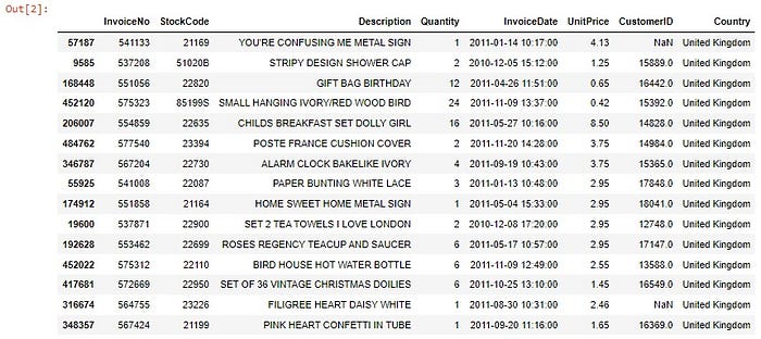
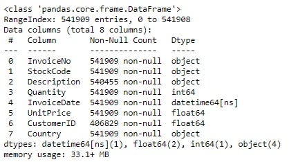
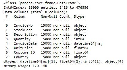
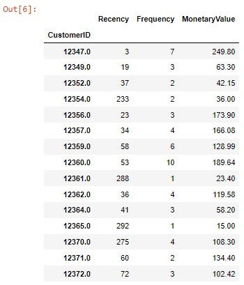
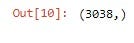
Well, as you may have noticed, we have a huge dataframe here, with negative values in Quantity’s column (maybe they are returns) and NaN values in CustomerID. Let’s assume that we can work with a sample of 15000 customers; we can also drop the rows without value at CustomerID:
Here we have the dataframe we are going to work with. We have information about the product’s description, the sold quantity, the date of purchase, customer’s ID, etc.
Our goal is to create a clustering model which divides the clients by its buying behaviour, and there is where the RFM analysis comes to our help.
In short, the Recency-Frequency-Monetary analysis proposes to filter costumers based on the mentioned factors:
- Recency: The numbers of days since the client did its last purchase. The lower, the better.
- Frequency: How many purchases have the client made.
- Monetary Value: How much money has the client spent.
That will help us to identify our customers by its behaviour in order to develop personalized strategies for each situation. For example, what if we have a group of clients that only made a purchase and never returned? What can we do to raise the frequency or the monetary value of the customers who have a high recency rate?
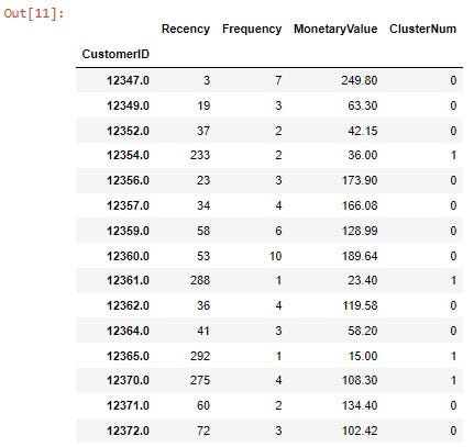
Let’s calculate these three values for our dataset:
Fine! Here we have our RFM table! But we can’t work on it yet… As you may notice, there is not consistency among the different data columns, in other words, each column’s has a different measuring variable. They don’t have neither the same mean nor variance, so we have to normalize these variables in order to establish its means at 0 and its standard deviation at 1 for a more accurate analysis:
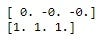
And here is our standardized dataframe:
At this point, we can start modeling our clustering algorithm in order to understand the table that we have. As I said in the introduction of this article, K-Means is one of the simplest ways to achieve this task; this unsupervised learning algorithm identifies a predefined “k” number of centroids and classifies the data points where the squared distance between each point and its cluster center (i.e Squared Error) is the minimal, creating differentiated groups.
The “k” number of clusters will sometimes depend on the company’s policy or requirements, while other times it can be established following some methods. We are going to follow the “Elbow Method”, which, in brief, gives us a graph that shows where the Sum of Squared Errors according to the “k” number of clusters starts to diminish; we will see an “elbow” that indicates us which “k” number is optimal according to our data. Let’s plot it:
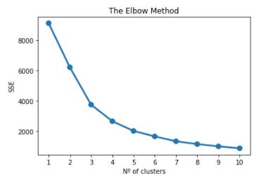
If we use our imagination, here we can see an arm with an elbow between 3 and 4, where the SSE starts to have a linear trend with the consecutives “k” values. Let’s set our optimum value for “k” in 4. Now we can deploy our model, dividing it in 4 clusters:
And that’s it! We have each variable scored with a cluster number according to its characteristics!
Now, by calculating the mean values, we can see the centroids of each cluster:
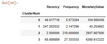
So there are our cluster’s centroids! The data points for each customer has been labeled according to the closeness to any of this 4 points. We should develop a strategy for each of those clusters, but before, let’s make an interactive 3D graphic by using Plotly’s Scatter3d library, always to better understand our data:
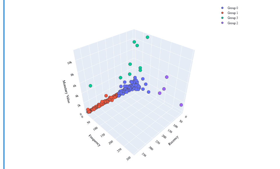
Brilliant! That’s a really interesting interactive table which shows us a well defined clustering model!
We have finished the technical section, but the work is not over yet. A good data analyst must know how to create a coherent story with the given data. Let’s review our groups in order to define the strategies:
- Group 0: It is composed by customers with a relatively low Recency but also a low Monetary and Frequency values.
- Group 1: This group has a high Recency value, with low Monetary and Frequency values.
- Group 2: Here we can see very low Recency values and the higher values of all the clusters for the Frecuency. Concerning the Monetary Values, they are better than the Groups 0 and 1.
- Group 3: Those costumers have the higher Monetary value and low values for the Recency, but they also have low Frequency values.
Groups 2 and 3 are very similar and, according to their values, they constitute our ideal type of clients. In consonance with that, we can develop same strategies for both of the groups in order to retain this kind of client (let’s remember that we found our “elbow” between the numbers 3 and 4, so 3 clusters could have been a good value too).
Given the context, let’s create a brief narrative:
We can find four defined groups among our clients. The Group 0, which we are going to call the “Blue Client”, has recently purchased, but it hasn’t yet spent too much. Those could be new clients who are discovering our website or our products, so for this group it may be interesting to develop fidelity strategies focused on increasing its frequency, i.e., to make them buy more. Promotions on the next buy, a discount for its 5º purchase of the same product, a points program… Those are only a few ideas of all of the many strategies that could be developed in order to increase the frequency of purchase.
The Group 1 is our churn customers, people who don’t visit regularly our web. They did an occasional purchase and didn’t return. We are going to call them the “Red Client” type. For this group we should maybe develop more aggressive campaigns with the aim of attracting them again. We can propose higher discounts for the next purchase, emailing them our new catalogue, special promotions, etc. It would be also interesting to ask for feedback, in order to unravel why do they never repeated their purchase.
Finally, the Groups 2 and 3, which we are going to treat together, are our “Green Clients”. They spend the most, with a good recency rate and frequency values. Those are our best customers, so our principal mission must be to keep their loyalty. We could propose strategies such fidelity cards, special rewards, personalized discounts and promotions, gift vouchers, etc., that could be advantageous to keep their recency levels high.
And that’s all! Now you have learned how to segment your customers by its RFM values by applying K-Means and how to plot it to make it more comprehensive. Thanks for reading!
You can check this notebook project, among others, in my GitHub’s page.
See you in the next article!
